“Branding” started years ago with Jason’s original idea and the name, alluding to “Open Sesame” opening the secret cave full of wonder and treasure. Ali Baba, 40 thieves, a magic lamp etc. A genie was kind of a given.
When spinning up this project at the start of the year Jason choose to use a “genie” emoji in the favicon of this page. Here is a genie emoji: 🧞 This will look different on different systems but I think he used Twitter’s gender neutral genie.
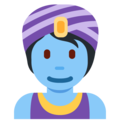
So I used the Twitter Genie emoji as a stand in for the app. (Though I switched to the male specific version. I think the other one just looked too young to be in charge of your passwords!)
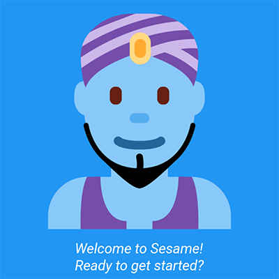
But we immediately knew we wanted a genie of our own.
We had a quick discussion about who we might know that could do the job and I suggested an ex-colleague Lisa Rye whose great work I often see on social media.
Lisa graciously and quickly took on our short notice project and worked within our time and budget constraints.
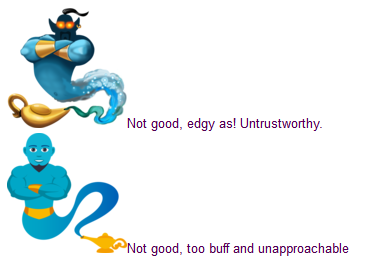
First I sent some guidance on what style we were after along with my 1 sentence reviews of almost all the different genie emojis from various operating systems.
For example:
Lisa quickly came back with some rough concepts for us to pick from:
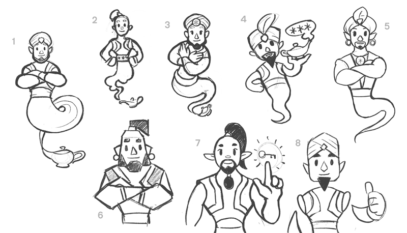
We were amped, they all look so friendly and trustworthy! So much to like and choose from.
Jason and I had basically the same thoughts on the designs, going with number 5 for the character design, number 4 for the stance and the key from number 7.
Lisa then came back with the 4 versions below:
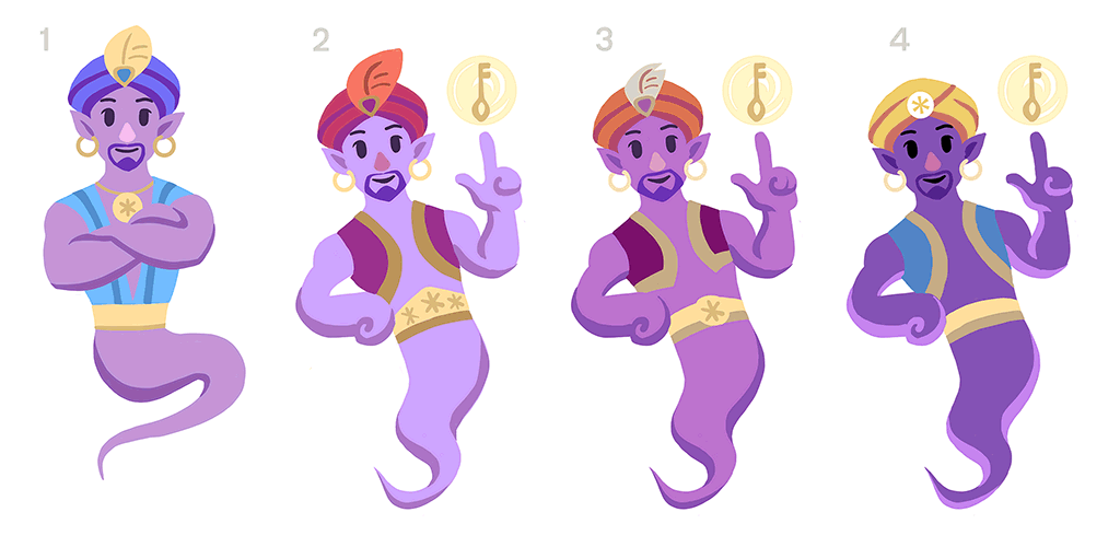
We loved stances of 2-3 but maybe not so jaunty and preferred the colours and outfit from number 1. Lisa sent back the final version with some suggested background colours:
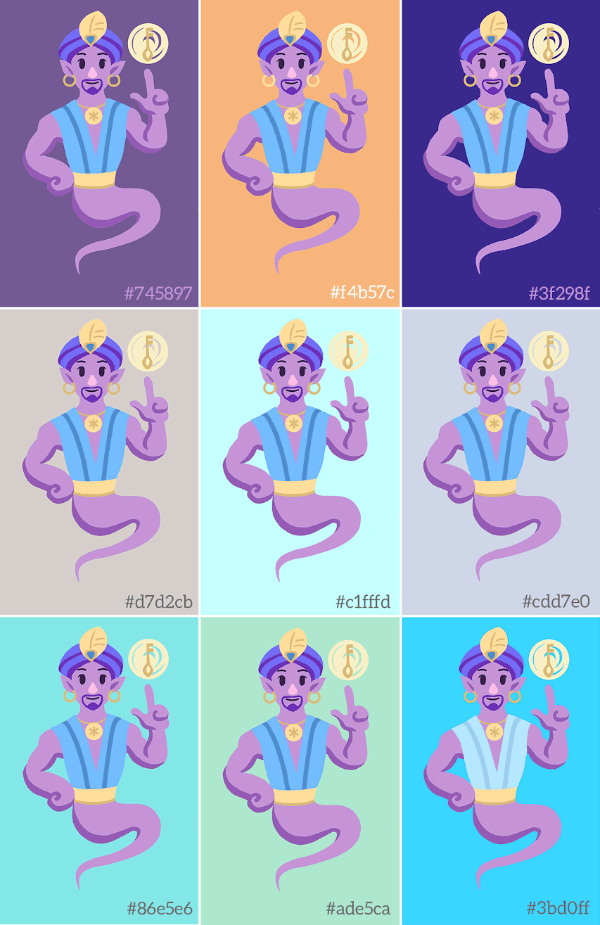
Our families both said they liked the dark purple and we thought it might be memorable and help us stand out. Also we use some of the other colours about the application.
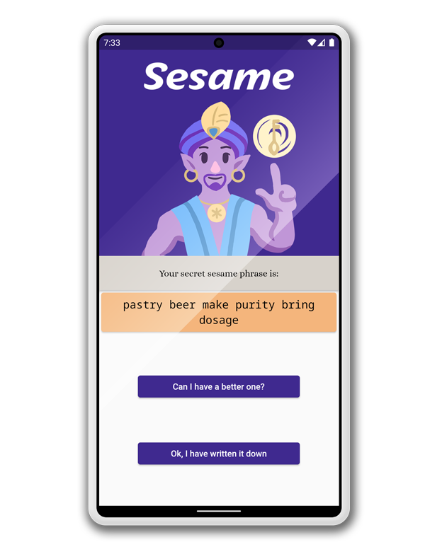
It was great fun working with a professional designer/illustrator, it came together amazingly easily and quickly.